Blue and white banner with the headline "4 Rebrands and What We Can Learn From Their Success (and Failure)". Under the headline is a white oval with "Odyssey Blog". To the right is a white circle with brand icon illustrations, featuring the letter "B".

4 Rebrands and What We Can Learn From Their Success (and Failure)

Blue and white banner with the headline "4 Rebrands and What We Can Learn From Their Success (and Failure)". Under the headline is a white oval with "Odyssey Blog". To the right is a white circle with brand icon illustrations, featuring the letter "B".

In the fast-moving business world of 2026, a brand is never truly finished. Rebranding is a high-stakes gamble: done well, it can catapult a legacy company into a new era of relevance; done poorly, it can alienate a loyal customer base and erase decades of equity in a single afternoon. 

From the bold digital pivots to the blandification of luxury, here are four iconic rebrands that offer vital lessons for every business owner and marketer.

1. The Bold Pivot: Nokia (2023)

For decades, the name Nokia was synonymous with indestructible mobile phones and the connecting people ringtone. However, after losing the smartphone war, the brand spent years in a sort of public identity limbo. In 2023, Nokia unveiled a sleek, abstract, and digital-first logo that looked nothing like its predecessor.

The Strategy: The goal was to signal a total break from the past. Nokia wanted the world to know it was no longer a handset manufacturer but a B2B technology leader focusing on 5G and industrial digitalisation.

The Lesson: Signal Change Clearly

  • Why it worked: Nokia understood that its old logo carried too much nostalgia baggage. By radically changing its visual identity, it forced the market to stop seeing it as a failed phone company and start seeing it as a modern infrastructure giant.
  • Takeaway: If your business model has fundamentally changed, your brand must reflect that shift immediately, or you risk being trapped by your own history.
Twitter logo, a blue bird, and the X logo on a diagonal black background.

2. The Identity Crisis: X (formerly Twitter) (2023)

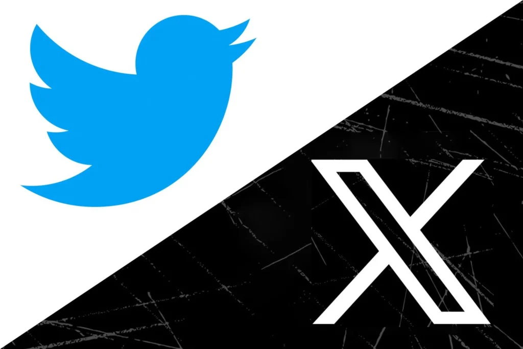
Perhaps the most controversial rebrand in recent history was the transformation of Twitter into X. Overnight, the iconic blue bird, one of the most recognisable symbols on the planet, was replaced by a generic Unicode character.

The Strategy: Elon Musk’s vision was to transform a social media platform into an everything app, moving away from the birds-chirping metaphor of short-form text toward a broader ecosystem of finance and video.

The Lesson: You Can’t Force Culture

  • Why it struggled: A brand is more than a logo; it’s a verb. People still tweet and check Twitter. By erasing a decade of cultural shorthand without a clear, functional reason for the change, the rebrand felt like an imposition rather than an evolution.
  • Takeaway: Brand equity is built over years. Scrapping a globally recognised identity requires a plan that offers more value than the recognition you are throwing away.

3. The Long Game: Kia (2021-2026)

When Kia first revealed its new logo, a rhythmic, unbroken line, the internet was confused. Google searches for the KN car spiked because many people couldn’t read the new typography. Critics called it a failure. Fast forward to 2026, and the narrative has shifted entirely.

The Strategy: Kia wasn’t just changing a logo; it was launching a Movement that inspires. The rebrand was timed perfectly with the release of the EV6 and EV9, cars that were dramatically more premium and design-led than their previous budget-friendly models.

The Lesson: Product Must Meet Promise

  • Why it worked: The rebrand succeeded because the product experience matched the new look. The cars became as sleek and futuristic as the logo. Kia proved that short-term confusion is a small price to pay for a total shift in market perception.
  • Takeaway: A logo cannot save a bad product, but a great product can give a confusing logo meaning. Be patient; brand perception takes time to catch up with visual change.
Comparison of Tropicana orange juice packaging before and after a design change, with the "before" carton featuring a whole orange and straw, and the "after" carton showcasing a glass of juice.

4. The Danger of Over-Simplification: Tropicana (2009)

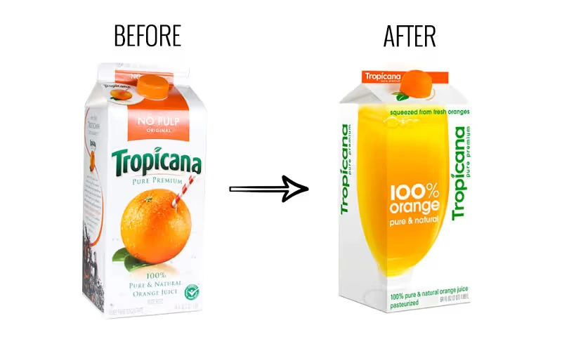
In 2009, the orange juice giant spent $35 million (around £25 million) on a brand overhaul, only to revert to its original design months later after sales plummeted by 20%.

The Strategy: Tropicana replaced its famous straw-in-an-orange imagery with a minimalist glass of juice and a clean, sans-serif font. They wanted to appear modern, sleek, and premium.

The Lesson: Don’t Break the Mental Map

  • Why it failed: The rebrand stripped away the most important visual cues that customers used to find the product on a crowded shelf. To the average shopper, the new packaging looked like a generic or store-brand product. By removing the orange, the universal symbol of freshness, they lost the emotional connection with the consumer.
  • Takeaway: Innovation is great, but never at the expense of findability. If you change your look so much that your loyal customers no longer recognise you, you’ve essentially handed your market share to your competitors.

Contact Our Experts For Digital Marketing Strategy

Contact our team of Digital Marketing Strategy specialists, who have the knowledge and expertise to fully optimise your social media and website, helping you increase the number of leads and conversions your business generates.

Call our team on 0121 439 5450, alternatively, fill out our contact form.

Are you ready to break new ground?

We will get you there.

Get in touch

Terms*
Odyssey New Media logo. A blue and white pixelated globe graphic within a blue and silver circular outline is to the left of the text "ODYSSEY" in blue, and "NEW MEDIA" in grey.
Odyssey New Media ® are a leading digital agency based in Birmingham, West Midlands, UK. With our many years of experience we know how to tailor a whole range of digital services to help businesses increase their traffic, revenue, and achieve good return on their development and marketing spend.
Office address:
Office No. 0009, The Old Bus Garage,
Harborne Lane, Selly Oak, Birmingham,
West Midlands, B29 6SN
Reg Company Number: 07297050
VAT Number: 223 5460 32
© Copyright Odyssey New Media - Terms & Conditions | Privacy Policy | Cookie Policy | Copyright Notice | Sitemap